AG
P 45 - C
Cosmetic Parts, UI Design & Renders
for PAXENTA
Reliable face of packaging
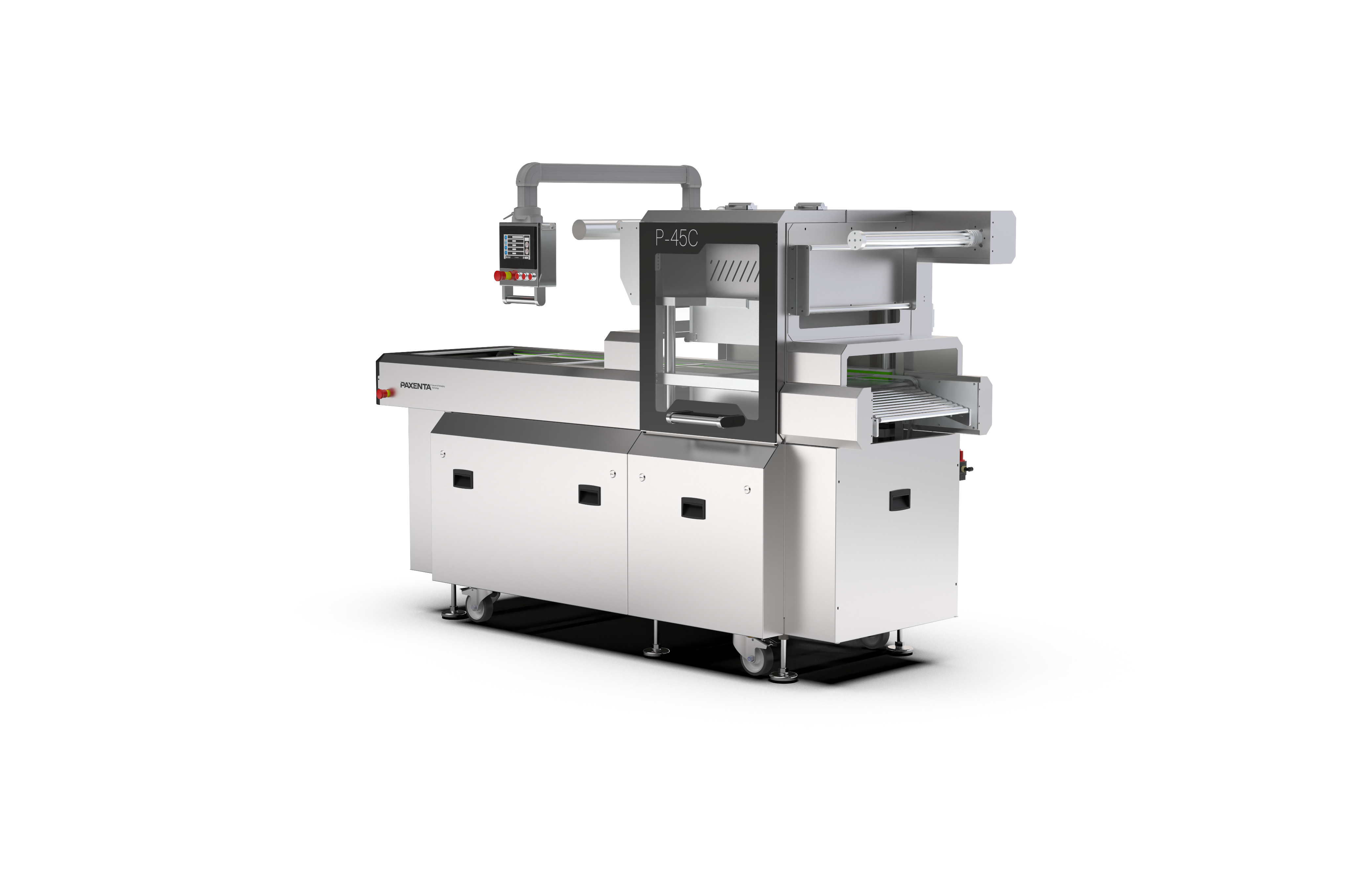
Paxenta is a new vacuum-packaging brand going up against much bigger global players. For their first machine, the P 45-C, I designed the parts people actually touch and read: the touchscreen interface, the cosmetic polycarbonate panels, the user manuals, the exhibition stands, and the official renders. The goal was to make a newcomer feel as considered and trustworthy as the established names, through design rather than budget.
Process
Sketching, Physical prototyping, CNC & Vynil print
UX research, Low & High fidelity prototyping,
UI design & Implementation support
Reading the machine at a glance
The P 45-C is operated by people mid-shift, gloved, often in a noisy room. The touchscreen interface had to be legible from a standing distance and unambiguous at speed. I designed the screen hierarchy around the three things an operator checks constantly; cycle state, vacuum level, and fault status. The cosmatic face is meant to provide confidence for the proud owner of the machine when showcasing their factories to possible clients and stakeholders.
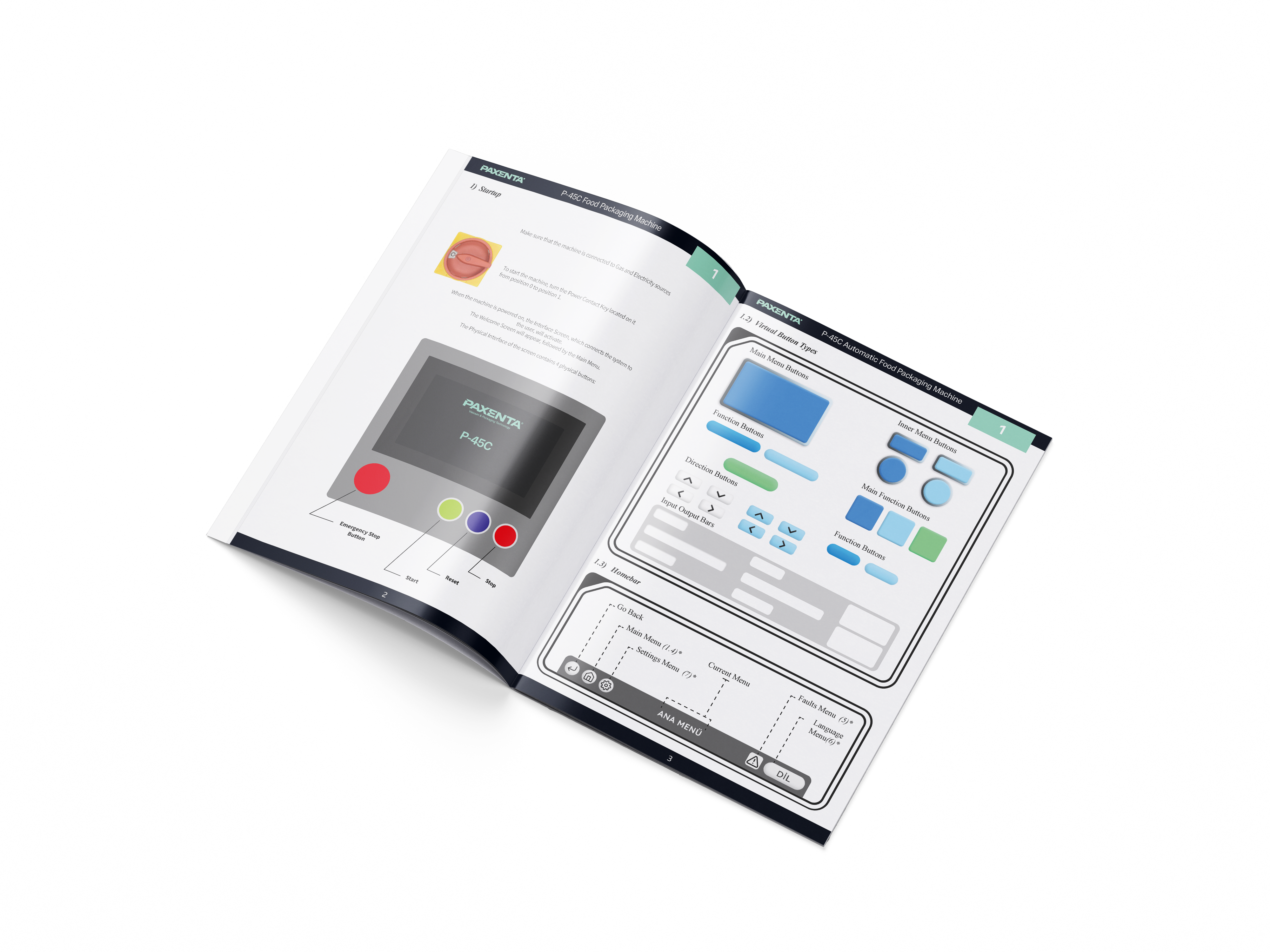
While the Owner is a stakeholder for the product, the end-user is the worker operating the machine. So we have to assume they have no to limited prior capasity to operate the machine, and the option of admin controls. This limits the UI design to be as basic as possible to ensure safety and ability to act quick.
Panels people touch
The workers should not touch the operational parts of the machine while keeping a clear visual of the process to ensure personal and operational safety. The polycarbon face of the machine is used in every Paxenta machine to differentiate the contact area in a clear manner as it is the only part that is colored.
Manuals, stands, renders
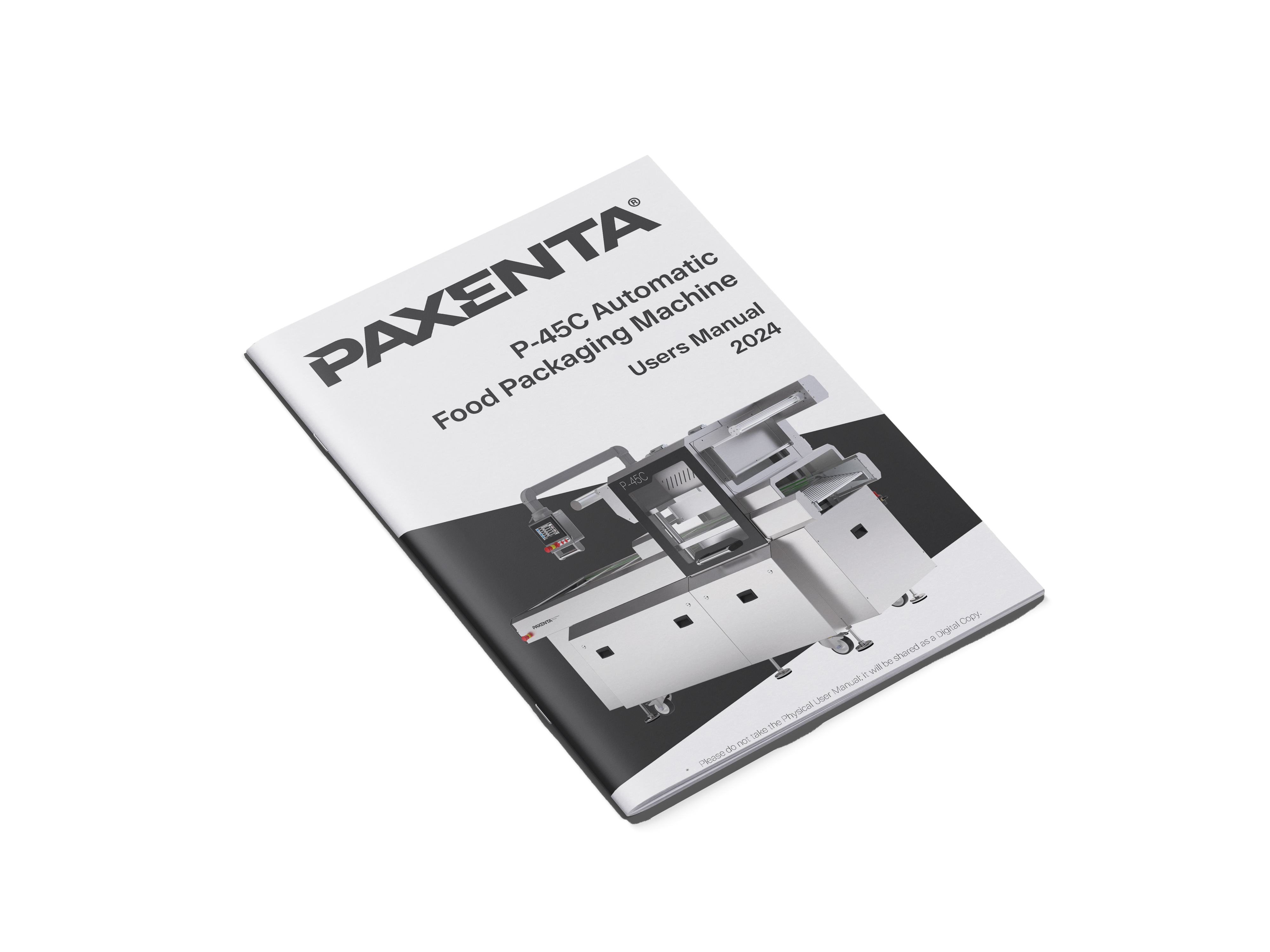
The operating UI is implemented in PLC’s of optional brands. These screens come with their operating systems custom coded for the specific machine and they require unison in operation language. Each P 45 - C comes with the user manual of the UI for customer input.
Design instead of budget
Paxenta out-thinks the competition instead of outspending them. Every decision was made to close the gap in perceived credibility without spending on it.
Social
Contact
+32 479079811
+90 5319246802
alkingultekin@gmail.com
Current Locations
1040 Brussels
34710 Istanbul
16130 Bursa
P 45 - C
Cosmetic Parts, UI Design & Renders for PAXENTA
Reliable face of packaging
Paxenta is a new vacuum-packaging brand going up against much bigger global players. For their first machine, the P 45-C, I designed the parts people actually touch and read: the touchscreen interface, the cosmetic polycarbonate panels, the user manuals, the exhibition stands, and the official renders. The goal was to make a newcomer feel as considered and trustworthy as the established names, through design rather than budget.
Process
Sketching, Physical prototyping, CNC & Vynil print
UX research, Low & High fidelity prototyping,
UI design & Implementation support
Reading the machine at a glance
The P 45-C is operated by people mid-shift, gloved, often in a noisy room. The touchscreen interface had to be legible from a standing distance and unambiguous at speed. I designed the screen hierarchy around the three things an operator checks constantly; cycle state, vacuum level, and fault status. The cosmatic face is meant to provide confidence for the proud owner of the machine when showcasing their factories to possible clients and stakeholders.
While the Owner is a stakeholder for the product, the end-user is the worker operating the machine. So we have to assume they have no to limited prior capasity to operate the machine, and the option of admin controls. This limits the UI design to be as basic as possible to ensure safety and ability to act quick.
Panels people touch
The workers should not touch the operational parts of the machine while keeping a clear visual of the process to ensure personal and operational safety. The polycarbon face of the machine is used in every Paxenta machine to differentiate the contact area in a clear manner as it is the only part that is colored.
Manuals, stands, renders
The operating UI is implemented in PLC’s of optional brands. These screens come with their operating systems custom coded for the specific machine and they require unison in operation language. Each P 45 - C comes with the user manual of the UI for customer input.
Design instead of budget
Paxenta out-thinks the competition instead of outspending them. Every decision was made to close the gap in perceived credibility without spending on it.
Social
Contact
+32 479079811
+90 5319246802
alkingultekin@gmail.com
Current Locations
1040 Brussels
34710 Istanbul
16130 Bursa
P 45 - C
Cosmetic Parts, UI Design & Renders for PAXENTA
New face of packaging
Paxenta is a new vacuum-packaging brand going up against much bigger global players. For their first machine, the P 45-C, I designed the parts people actually touch and read: the touchscreen interface, the cosmetic polycarbonate panels, the user manuals, the exhibition stands, and the official renders. The goal was to make a newcomer feel as considered and trustworthy as the established names, through design rather than budget.
Process
Sketching, Physical prototyping, CNC & Vynil print
UX research, Low & High fidelity prototyping,
UI design & Implementation support
Reading the machine at a glance
The P 45-C is operated by people mid-shift, gloved, often in a noisy room. The touchscreen interface had to be legible from a standing distance and unambiguous at speed. I designed the screen hierarchy around the three things an operator checks constantly; cycle state, vacuum level, and fault status. The cosmatic face is meant to provide confidence for the proud owner of the machine when showcasing their factories to possible clients and stakeholders.
While the Owner is a stakeholder for the product, the end-user is the worker operating the machine. So we have to assume they have no to limited prior capasity to operate the machine, and the option of admin controls. This limits the UI design to be as basic as possible to ensure safety and ability to act quick.
Panels people touch
The workers should not touch the operational parts of the machine while keeping a clear visual of the process to ensure personal and operational safety. The polycarbon face of the machine is used in every Paxenta machine to differentiate the contact area in a clear manner as it is the only part that is colored.
Manuals, stands, renders
The operating UI is implemented in PLC’s of optional brands. These screens come with their operating systems custom coded for the specific machine and they require unison in operation language. Each P 45 - C comes with the user manual of the UI for customer input.
Design instead of budget
Paxenta out-thinks the competition instead of outspending them. Every decision was made to close the gap in perceived credibility without spending on it.
Reading the machine at a glance
The P 45-C is operated by people mid-shift, gloved, often in a noisy room. The touchscreen interface had to be legible from a standing distance and unambiguous at speed. I designed the screen hierarchy around the three things an operator checks constantly; cycle state, vacuum level, and fault status. The cosmatic face is meant to provide confidence for the proud owner of the machine when showcasing their factories to possible clients and stakeholders.
While the Owner is a stakeholder for the product, the end-user is the worker operating the machine. So we have to assume they have no to limited prior capasity to operate the machine, and the option of admin controls. This limits the UI design to be as basic as possible to ensure safety and ability to act quick.
Panels people touch
The workers should not touch the operational parts of the machine while keeping a clear visual of the process to ensure personal and operational safety. The polycarbon face of the machine is used in every Paxenta machine to differentiate the contact area in a clear manner as it is the only part that is colored.
Manuals, stands, renders
The operating UI is implemented in PLC’s of optional brands. These screens come with their operating systems custom coded for the specific machine and they require unison in operation language. Each P 45 - C comes with the user manual of the UI for customer input.
Design instead of budget
Paxenta out-thinks the competition instead of outspending them. Every decision was made to close the gap in perceived credibility without spending on it.
Social
@alkin_gultekin
www.linkedin.com/in/alkın-gültekin-815220209
Current Locations
1040 Brussels
34710 Istanbul
16130 Bursa
Contact
+32 479079811
+90 5319246802
alkingultekin@gmail.com